Retail Store Branding: From Entrance Signage to In-Store Displays
By iMad · · 6 min read
Retail branding
Fascia and entrance
Counters and billing
In-store lighting
Kiosks and malls
In this article
Retail store branding is the work of making every part of a shop, from the signboard outside to the billing counter inside, express one identity. The easiest way to plan it is to walk the customer journey in order. This guide follows that path, explains what each touchpoint needs and shows how to brief a branding partner.
Plan the journey before the pieces
Many shops are branded piece by piece: a board first, a counter later, shelving whenever something is needed. The result is often a collection of items that do not belong together. A better approach is to treat the store as a single experience and decide the overall direction first. For the bigger picture, see our guide to consistent brand experience in retail.
iMad’s retail branding services follow this logic: understand the business, design the layout, colour scheme and 3D view, and then execute the interiors and exteriors.
Approach and fascia
The fascia is your shop’s first message. From the road or the market lane, a passer-by decides in seconds whether to look closer. It should state who you are and what you sell, in lettering that can be read from a distance.
Keep the name large and the supporting text short.
Choose a material and finish that suits the surroundings, since signage in Jaipur faces strong sun, dust and monsoon rain.
Think about the evening: lit signage, such as LED boards, can make the shop visible after dark.
In heritage areas such as the Walled City, check local requirements before you decide the design.
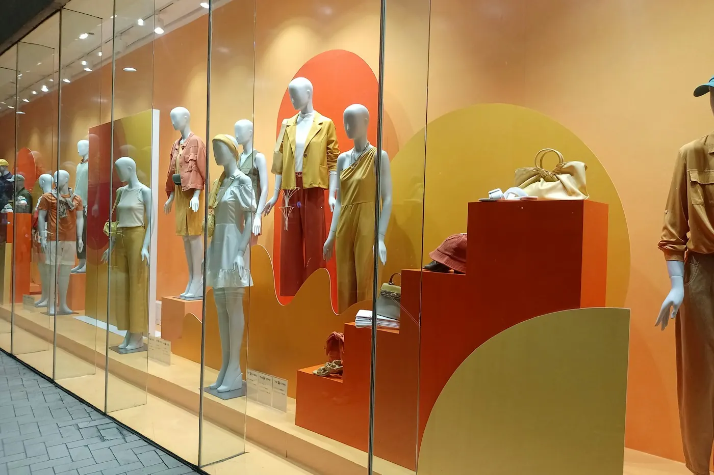
The entrance should feel inviting and obvious. Customers should easily see where the door is, what is on offer and whether the shop is open. The window works as a moving advertisement, so it needs a focused message rather than a crowd of posters.
Use glass graphics or vinyl for the offer or brand message, but leave enough clear glass for people to see inside.
Keep the doorway free of clutter, standees and stock.
Refresh window messages often, so the shop looks active.
Interior layout and zoning
Once customers step inside, layout guides their movement. Zoning means dividing the space by purpose: an entrance zone, product zones, a trial or consultation area and a billing zone. Each area should be recognisable through its fixtures, colour and graphics.
Think about the path a customer will naturally take. Place popular or eye-catching items where people can see them early, and keep the route clear enough that people can move without feeling crowded. Layout, colour and 3D design are best agreed before any work starts, because changes after fabrication are slow and costly.
Counters and billing
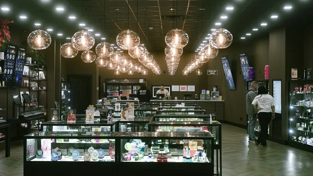
The counter is where the sale closes, so it should look orderly and professional. A customised counter, part of our retail branding services, can hold the billing system, packaging and small impulse items while showing your brand clearly on the front. Keep it tidy, make the brand visible from the customer’s side and leave workable space for staff.
Product display stands and racks
Stands and racks present your products and shape how customers browse. Their height, spacing and finish affect how easy it is to see and pick up items. Custom stands, one of the things our retail branding team can design, are built around your actual products rather than standard fixtures.
Match the stand to the product: shoes, garments, small gifts and packaged goods all need different supports.
Keep the key items at comfortable eye and reach height.
Use consistent materials and colours across stands so the shop feels unified.
Allow room for restocking without making the display look crowded.
Wall graphics and in-store communication
Walls are valuable space. They can hold your brand story, product photographs, offer messages and directional signs. Clear in-store communication saves staff time because customers can find categories and prices themselves.
Lighting
Lighting shapes how products and brand colours look. Bright, even lighting suits most general retail, while accent lighting can draw attention to a feature wall or a premium product. Decide on lighting while the layout is being planned, not afterwards, so that fixtures, graphics and display stands support one another.
Kiosks and mall stores
Kiosks and compact mall outlets face a different challenge: little space and many competing brands. They need a recognisable look, a clear offer and a design that works from every side, since customers can approach from several directions.
Make the brand name visible from all approach points.
Build storage into the structure, so stock does not sit in view.
Follow the mall’s own rules for dimensions, fixtures and finishes, which are usually supplied by the mall management.
Keep the layout open enough for staff and customers to move comfortably.
Making limited floor space work
Small shops can look cluttered quickly. Wall-mounted racks, display units with built-in storage and a clear separation between display and stock can all help. Choose fewer, better-placed pieces instead of filling every corner. A smaller, well-designed layout often feels more premium than a large one with too many items.
How the touchpoints connect
A customer does not experience these elements separately. A bold fascia promises a certain kind of shop, and the interior should deliver on it. If the board suggests a premium store but the shelving looks improvised, trust drops quickly.
Repeat a few visual cues from outside to inside: the same colours, the same lettering style and the same tone of messaging. When the exterior and interior share these cues, the shop feels deliberate and easy to remember, and it becomes simpler to extend the look to bags, uniforms and packaging later.
A pre-brief checklist
A branding partner works best when you share clear information at the start. Gather these before you speak to anyone:
Your logo files, brand colours and any existing brand guidelines.
A floor plan or measurements of the space, and photographs of the exterior and interior.
The product range, and what you most want to highlight.
Your target customers and how they usually shop.
Any rules from the landlord, mall or local authority.
Your timeline, including the planned opening or relaunch date.
Examples of stores you like, and what you like about them.
What to hand a branding partner
Beyond the checklist, be honest about priorities. If the budget is limited, decide which touchpoints matter most, usually the fascia, entrance and billing counter, and phase the rest.
Common retail branding mistakes
Branding the exterior and ignoring the interior, or the other way round.
Using too many fonts, colours and styles across boards, graphics and fixtures.
Crowding the window and entrance with offers.
Choosing materials without considering sun, dust and monsoon conditions.
Ordering fixtures before the layout is decided.
Forgetting lighting until the end of the project.
Overlooking local rules for boards, particularly in heritage or mall locations.
Start a store branding project with iMad
iMad is a Jaipur-based brand promotion company. We listen to what your store needs, recommend a plan, design the layout and 3D view, and then deliver the work. If you are opening or refreshing a shop, tell us about it on our contact page and we can discuss the right approach. You can also see related signage services for fascia boards and lettering.
Start by walking your customer’s path from the street to the billing counter and noting each touchpoint: fascia, entrance, layout, displays, counter and lighting. Agree the overall layout, colour scheme and design direction first, then execute piece by piece so everything matches.
Which parts of a store matter most for a small budget?
Generally the fascia, the entrance and window, and the billing counter, since customers see these first and last. Once those work, add display stands, wall graphics and lighting in phases. Planning the full layout early prevents later additions from clashing with what is already installed.
What is a 3D design in store branding, and do I need one?
A 3D design is a visual of how the finished store will look, including layout, colours, fixtures and graphics. It lets you spot problems and suggest changes before anything is built. It is especially useful for interiors, kiosks and custom counters, where changes after fabrication are slow.
How should I brand a mall kiosk differently from a shop?
A kiosk is usually approached from several sides, so the brand must be visible from every direction, with built-in storage and a clear offer. Malls also have their own rules for size, fixtures and finishes, so check those before design. A compact, open layout keeps staff and customers comfortable.
A consistent retail identity helps customers recognise and trust your store. Here is how to standardise brand elements and carry them from the fascia to the shopping bag.