
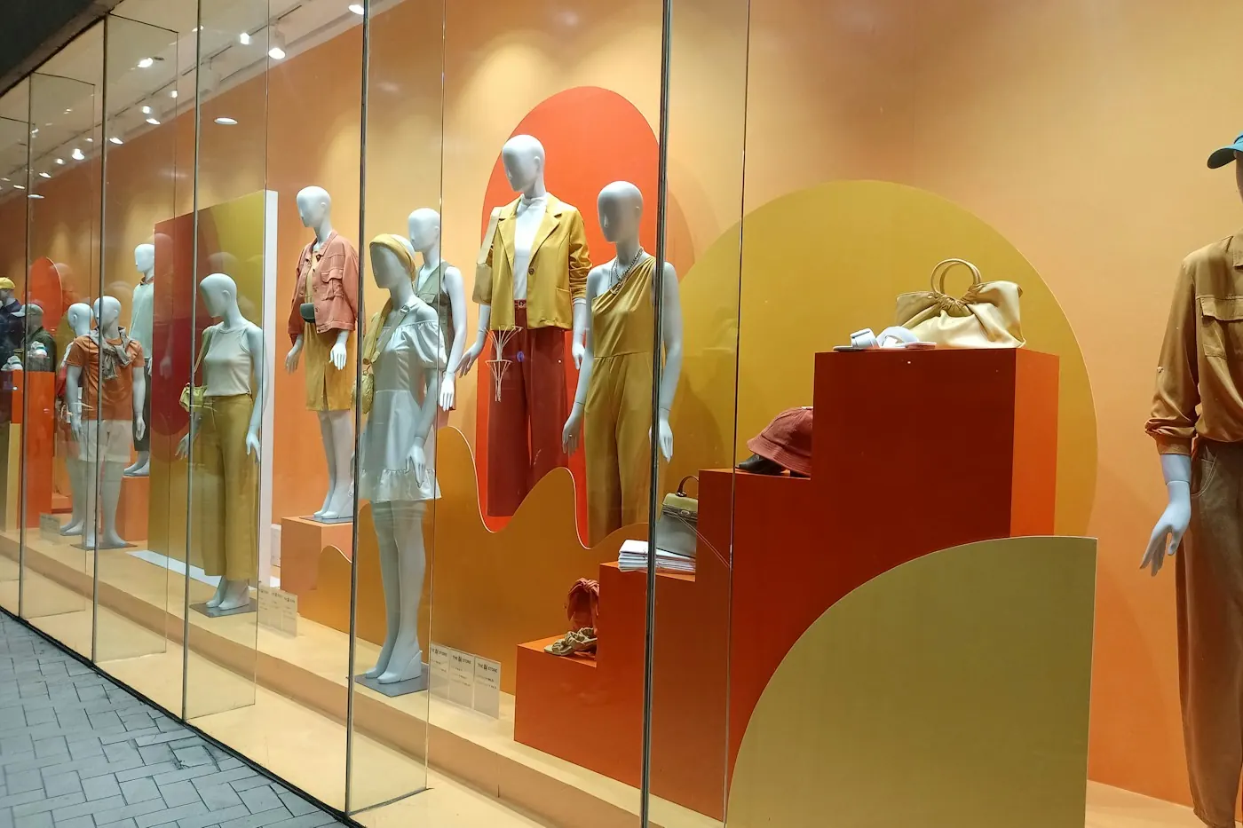
Retail
Retail Store Branding: From Entrance Signage to In-Store Displays
Retail store branding works best when you plan it as one customer journey. Walk through each touchpoint, from fascia to billing counter, and see what each one needs.
6 min read
Retail
By iMad7 min read
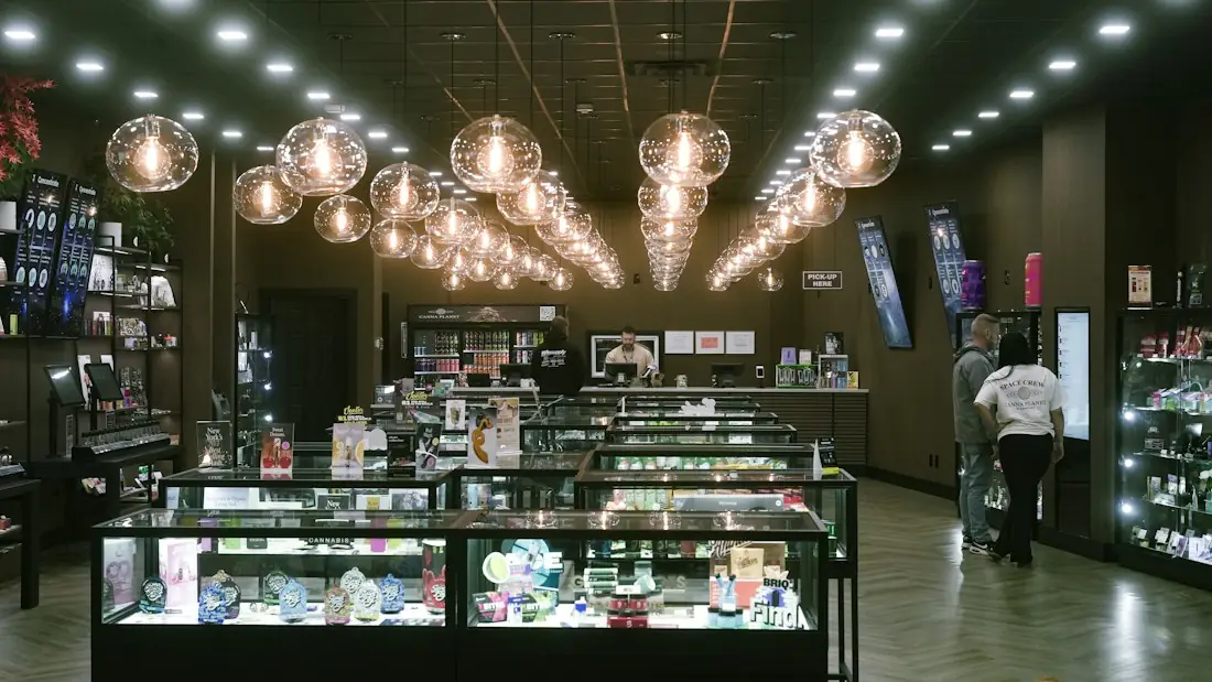
Retail branding is how your brand shows up in physical form: the signboard outside, the colours and lighting inside, the counter where billing happens and the bag the customer carries home. It works when these pieces look and feel like they belong to one business. This article focuses on the identity system behind a store and how to keep it consistent.
Many owners think of branding as a logo. In a store, the logo is only the starting point. Retail branding is the full set of visual and physical decisions that tell a customer who you are, what you sell and what kind of experience to expect.
A shopper decides quickly whether a store feels organised, premium, affordable or confusing. Those impressions come from many small signals working together, not from one big element. That is why a retail brand is built as a system rather than as a collection of separate purchases.
People recognise what they have seen before. When your fascia, shelves, bags and printed offers all use the same colours and type, each one reminds the customer of the others. Recognition builds with every repeat.
Consistency also supports trust. A store that looks cared for in every detail suggests a business that is careful about its products and service. Mismatched colours, three different logo versions or a faded signboard next to a fresh counter send the opposite message, even if the product is good.
Before any fabrication or printing begins, fix the elements that will repeat. Write them down in a short brand sheet so that every vendor and every new outlet works from the same reference.
Colour and logo usually get attention first. Materials and lighting are decided later, often by different people, and that is where stores start to look inconsistent. A gloss finish on the counter and a matte one on the shelves, or a cool white fascia over a warm interior, can quietly weaken the identity.
Once the elements are fixed, apply them in the same order a customer meets them. For a detailed walk-through of the shopper journey itself, see our guide to retail store branding from entrance to in-store displays. Here the focus is on what must stay consistent.
Turning a brand on paper into a physical store is easier with a clear sequence. This method keeps decisions tied to the brand, not to whatever is available at the time.
Consistency gets harder when a brand appears in more than one place. A flagship store, a smaller outlet and a mall kiosk have different sizes and constraints, but customers should still recognise them as one brand.
The usual approach is a flexible kit of parts: a fixed logo and colour system, a small set of approved layouts, and a few repeatable fixtures that scale up or down. Mall and kiosk formats often come with their own rules on height, lighting and branding area, so check these with the mall management early. When fixtures, counters and graphics come from one plan, a new outlet is easier to set up and looks like the others.
A store is expensive to change once built. Layout drawings and 3D visuals let you check proportions, sight lines, colour balance and lighting before any material is cut or printed. They also help the owner, designer and the execution team agree on one picture.
Look for problems on screen first: a counter that blocks the entrance path, a fascia that is too crowded, a colour that looks harsher in the proposed lighting. Retail branding services at iMad cover layout, 3D design and execution of interiors and exteriors, so the design stage connects directly to what is built.
Brand consistency does not end on opening day. Signboards fade in strong sun, lights fail, printed material gets replaced with whatever is quickest and shelves are rearranged. Over time the store drifts away from the original look.
If you are opening or updating a store and want the fascia, interiors, counters and printed material to work as one identity, you can see how this ties into the wider approach in our complete guide to business branding in Jaipur, and see how the supporting corporate branding materials fit in. To discuss your store, contact iMad and we will first understand your needs, then recommend, design and deliver.
Retail branding is the way a brand is expressed in a physical store, including the signboard, interiors, counters, displays, packaging and printed material. The aim is for every part to share the same logo, colours, typography and style, so customers recognise the business and understand what it stands for.
Create a written brand sheet and a small kit of approved layouts and fixtures, then reuse them in each outlet. Sizes and formats may differ, especially in malls or kiosks, but logo, colours, materials and lighting should stay the same. Keep artwork files saved so reprints and repairs match the original.
Start with the logo versions, colour scheme and typefaces, since these affect everything else. Then fix materials, finishes and lighting, which are often forgotten. Once these are written down, signage, interiors, packaging and printed items can all be designed from the same reference.
Layout and 3D visuals let you check proportions, customer movement, colour balance and lighting before anything is fabricated. Problems are cheaper to fix on screen than on site. They also give the owner, designer and execution team one shared picture to approve.
There is no fixed schedule. Refresh when graphics look worn, the brand direction changes or the store feels dated next to competitors. Update all touchpoints together, so the fascia, interior and packaging stay aligned, and carry out regular upkeep in between.
Retail
Retail store branding works best when you plan it as one customer journey. Walk through each touchpoint, from fascia to billing counter, and see what each one needs.
6 min read
Branding
Which branding materials does a business actually need, in what order, and how do you keep them consistent across suppliers? A practical guide with a checklist.
6 min read
Branding
Physical branding works as a system. This guide explains each part, how to combine and sequence them, how to write a brief and what to consider locally in Jaipur.
8 min read
Tell iMad what you need and where, and we will suggest the right approach.